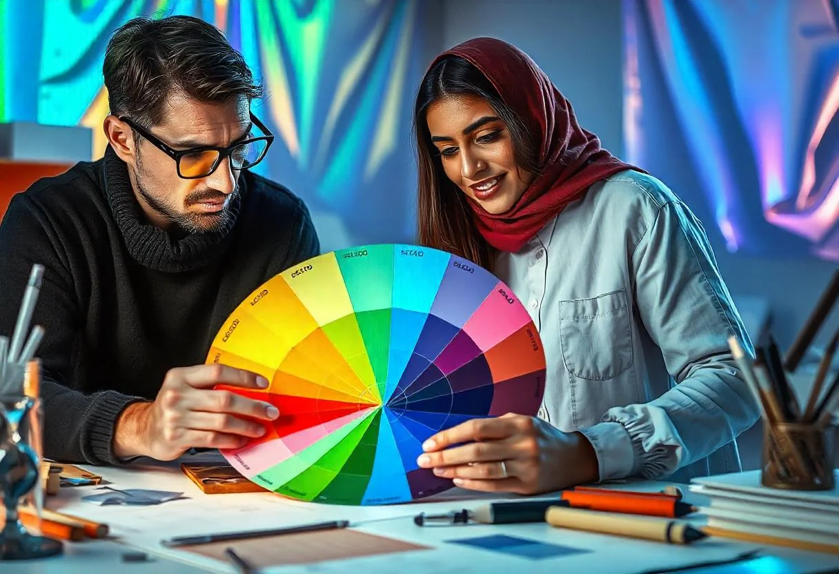
Colors, as one of the main components of graphic design, not only enhance visual appeal but also have a profound impact on human psychology. In color psychology, each color is associated with specific emotions, experiences, and even behaviors that can influence a viewer’s perception, reaction, and decision-making. In fact, colors are not only effective in attracting attention and beautifying designs but also play a crucial role in visual communication and conveying specific messages.
The impact of colors on psychology is such that they can significantly affect a person’s emotions. For example, red is associated with excitement and energy, while blue conveys a sense of calm and trust. Proper use of colors can create a unique visual and emotional experience for the audience and be effective in building brand identity or attracting customers.
In graphic design, understanding the psychology of colors and their influence on human perception and behavior is of great importance. Graphic designers can utilize color psychology principles to use colors as a powerful tool for communicating brand messages, capturing attention, and creating specific effects in their designs. This article explores the impact of colors in color psychology and their application in graphic design, demonstrating how the right color choices can lead to more effective and impactful designs.
The Symbolism of Colors in Website Design
In website and graphic design, colors not only play a significant role in aesthetics but also have psychological effects on user experience (UX) and emotional responses. Each color in web design has a unique meaning and can evoke different feelings and behaviors in users. By understanding and correctly applying color psychology, designers can create a more effective and engaging user experience.
Red in web design is typically associated with energy, excitement, and urgency. This color can convey strong emotions like passion or even danger. Using red in websites that require immediate attention can be effective. It is a stimulating color and is generally used in color psychology to increase activity and excitement.
Blue conveys a sense of calm, trust, and security due to its psychological properties. It is often used in corporate, banking, healthcare, and consulting websites as a symbol of reliability and professionalism. This color gives users a sense of comfort and security and is widely used in corporate and financial service websites. Choosing the right shade of blue can enhance user trust and conversion rates.
Green symbolizes growth, nature, and health in color psychology. Using this color in websites related to the environment, healthcare, pharmaceuticals, and organic products can evoke a sense of freshness and connection to nature. Green is particularly effective in sites that aim to convey relaxation, balance, and well-being. It helps create a sense of trust and stability in the user’s mind.
Yellow is a bright and energetic color naturally associated with happiness and optimism. In web design, yellow can create a sense of positivity and vibrant appeal. This color is highly effective in websites related to children, entertainment, and brands that want to convey energy and cheerfulness. However, excessive use of yellow should be avoided as it may cause eye strain.
Orange, a combination of red and yellow, symbolizes energy, creativity, and excitement. In web design, orange can create a sense of urgency and stimulation, making it ideal for call-to-action buttons, advertisements, and special offers. This color is especially used in technology and startup websites to attract attention and evoke positive emotions. Orange is a high-energy color that has an immediate impact on user behavior.
Black in web design represents power, sophistication, and formality. It is commonly used in luxury brands, fashion, automotive, and minimalist designs. Due to its psychological impact, black can highlight brands with a strong and professional identity. This color also conveys a sense of elegance and distinction.
White symbolizes simplicity, cleanliness, and openness. In website design, white is often used as a background or in minimalist designs. It provides users with a sense of calm and freedom, allowing other design elements to stand out. Since white is a neutral color, it can be easily combined with other colors to create balance and harmony in web design.
Purple represents luxury, creativity, and mystery. Using this color in artistic websites, magazines, and high-end brands can create a unique and distinguished feel. In color psychology, purple conveys sophistication and beauty, particularly in designs related to fashion and the arts.
| Colors | Symbol and features | The psychological impact of colors | Usage in Web Design |
|---|---|---|---|
| Red | Energy, excitement, urgency | Stimulation, immediate attention, enthusiasm | Ads, discounts, buy buttons |
| Blue | Peace, trust, security | Creating a sense of security, trust, and peace | Corporate, banking, health sites |
| Green | Nature, growth, health | Balance, trust, peace | Environment, Health, Medicine, Organic |
| Yellow | Happiness, optimism, creativity | Positive energy, optimism | Sites related to children, entertainment |
| Orange | Energy, creativity, stimulation | Create urgency and a sense of excitement | Action buttons, technology, startups |
| Black | Power, complexity, formality | Credibility, formality, professionalism | Luxury brands, fashion, cars, minimalism |
| White | Simplicity, cleanliness, open space | Peace, freedom, balance | Website backgrounds, minimalist design |
| Purple | Luxury, creativity, mystery | Complexity, beauty, luxury | Art, luxury, and luxury brands |
Color Analysis in Major Brands
Blue is one of the most widely used colors in major brands, primarily chosen to evoke feelings of trust, security, and calmness. Companies such as Facebook, Microsoft, and Checkpoint use blue in their logos and brand identities. In color psychology, blue is recognized as a symbol of peace and reliability, making it a suitable choice for brands aiming to establish trust with their audience.
Red is a color that can evoke excitement, energy, and even urgency in the viewer’s mind. Leading brands such as Coca-Cola, McDonald’s, and Netflix use red to stir emotions like passion and enthusiasm.
Green is associated with nature and growth and is used by major brands across various industries to convey a sense of tranquility, health, and honesty. Brands such as Starbucks, Hillary Clinton, and Bosch use green as a symbol of nature, freshness, and well-being.
Yellow is a bright, high-energy color typically associated with optimism, creativity, and joy. Major brands such as Ferrari, Nokia, and IBM use yellow to create a sense of positivity and enthusiasm.
Black is a powerful color commonly used by brands that want to convey luxury, sophistication, and professionalism. Companies such as Apple, Louis Vuitton, and Nike incorporate black into their brand identities.
Custom Graphic Design at Digi Web
At Digi Web, you can order and customize your designs based on your personal taste and preferred colors. To place an order for your graphic designs, simply select one of the contact methods from our Contact Us section or fill out the Graphic Design Request Form, and we will get in touch with you shortly.




6 Comments
Join the discussion and tell us your opinion.
Thank you
You’re welcome
This aricle was great
Thanks Kate
I need this article. Thanks
I’m glade to like this article